
tab Design
In tab Design there are global options which allows to setup different design features to the HUSKY filters
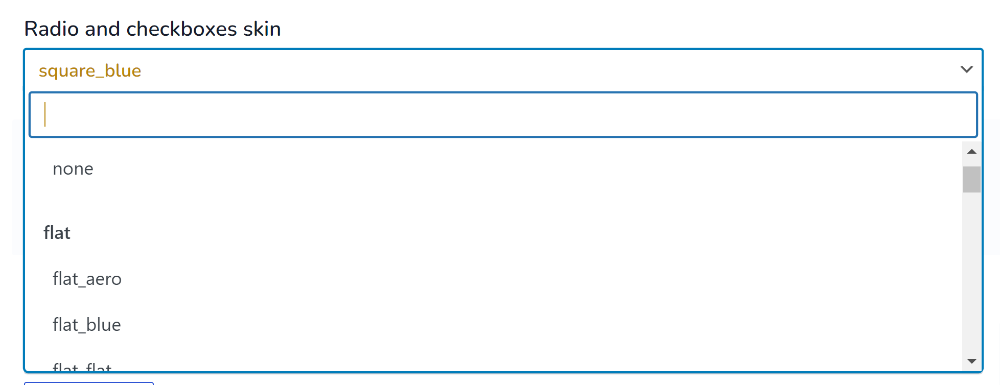
- Radio and checkboxes skin – here is possible to select skins for radio and checkbox filter-elements
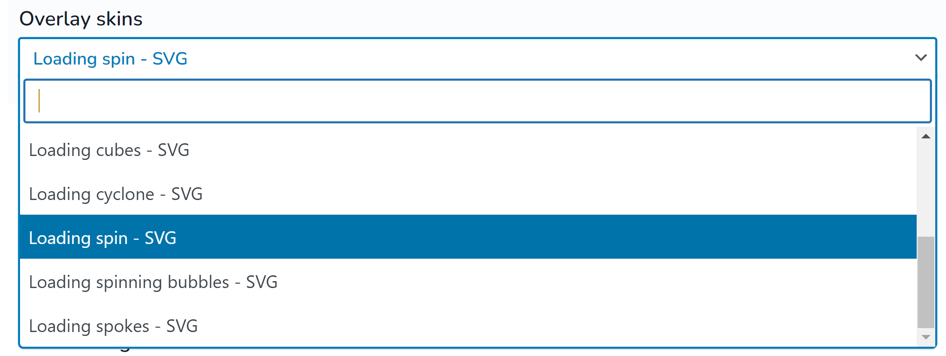
- Overlay skins – while products are filtering after selecting any filter-elements loader appears, here is possible to select its view
- Overlay image background – while loader is appears it can has its background, here it is possible to select background image for this
- Select design – here is possible to select skin for drop-down filter-elements (tag select)
- Use beauty scroll – if filter-block has height scroll bar appears, so instead of standard scroll here you can enable scrollbar skin
- Range-slider skin – skins for filter-elements of view-type range-slider
- Use tooltip – use tooltip for filter elements
- Hide auto filter by default – if in tab Options enabled option ‘Set filter automatically‘ its can be opened or closed by default when user entered into shop page
- Skins for the auto filter – if in tab Options enabled option ‘Set filter automatically‘ it is possible to set skins to its layout (columns, background color)
- Tooltip icon – image which displayed for tooltip
- Auto filter close/open image – if in tab Options enabled option ‘Set filter automatically‘ here is possible to select icon for it
- Auto filter close/open text – if in tab Options enabled option ‘Set filter automatically‘ here is possible to select text for it
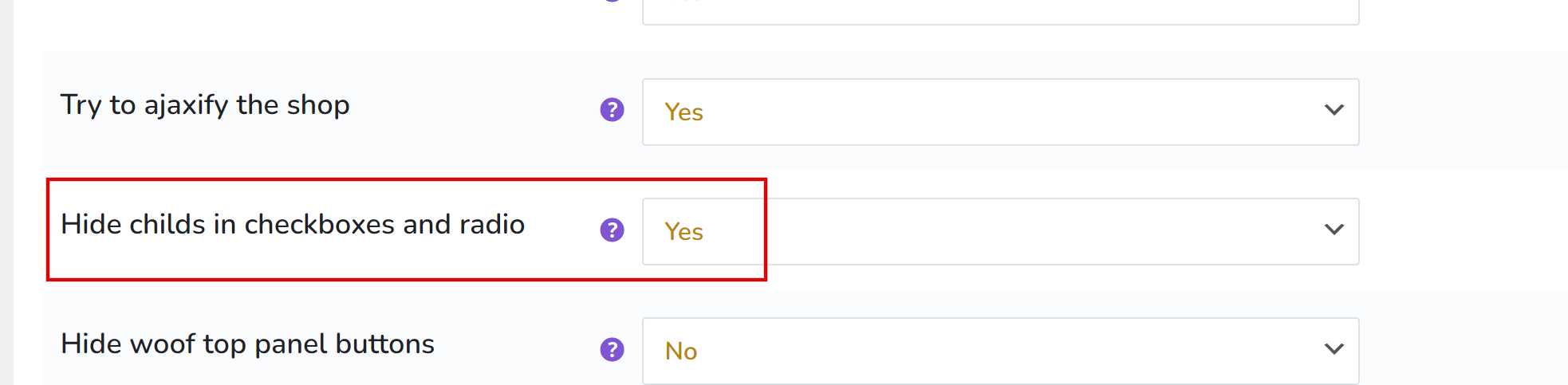
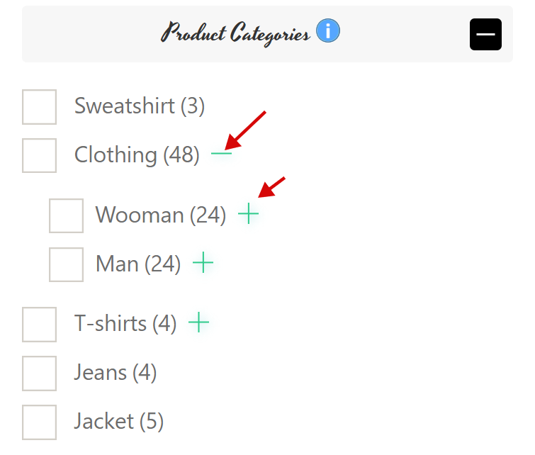
- Image for subcategories open – image to open sub-terms if they are hidden by option in tab Options ‘Hide childs in checkboxes and radio‘
- Image for subcategories close – image to close sub-terms if they are hidden by option in tab Options ‘Hide childs in checkboxes and radio‘
- Image for mobile filter button – image of button when activated mobile mode. Set -1 to disable
- Text for mobile filter button – text for button when activated mobile mode. Set -1 to disable
- Image to close mobile filter – image for close button when activated mobile mode. Set -1 to disable
- Text to close mobile filter – text for close button when activated mobile mode. Set -1 to disable
- Toggle block type – type of the toggle on the front for block of html-items as: radio, checkbox …. Works only if the block title is not hidden!
- Image for block toggle [opened, closed] – any image for opened html-items block 20×20
- Image for block toggle closed – any image for closed html-items block 20×20
- Custom front css styles file link – for developers who want to rewrite front css of the plugin front side. You are need to know CSS for this!
Troubles? Ask for Support!